Pomodoro Timer, a UI Development Exercise
2 Min Read | Project
Overview
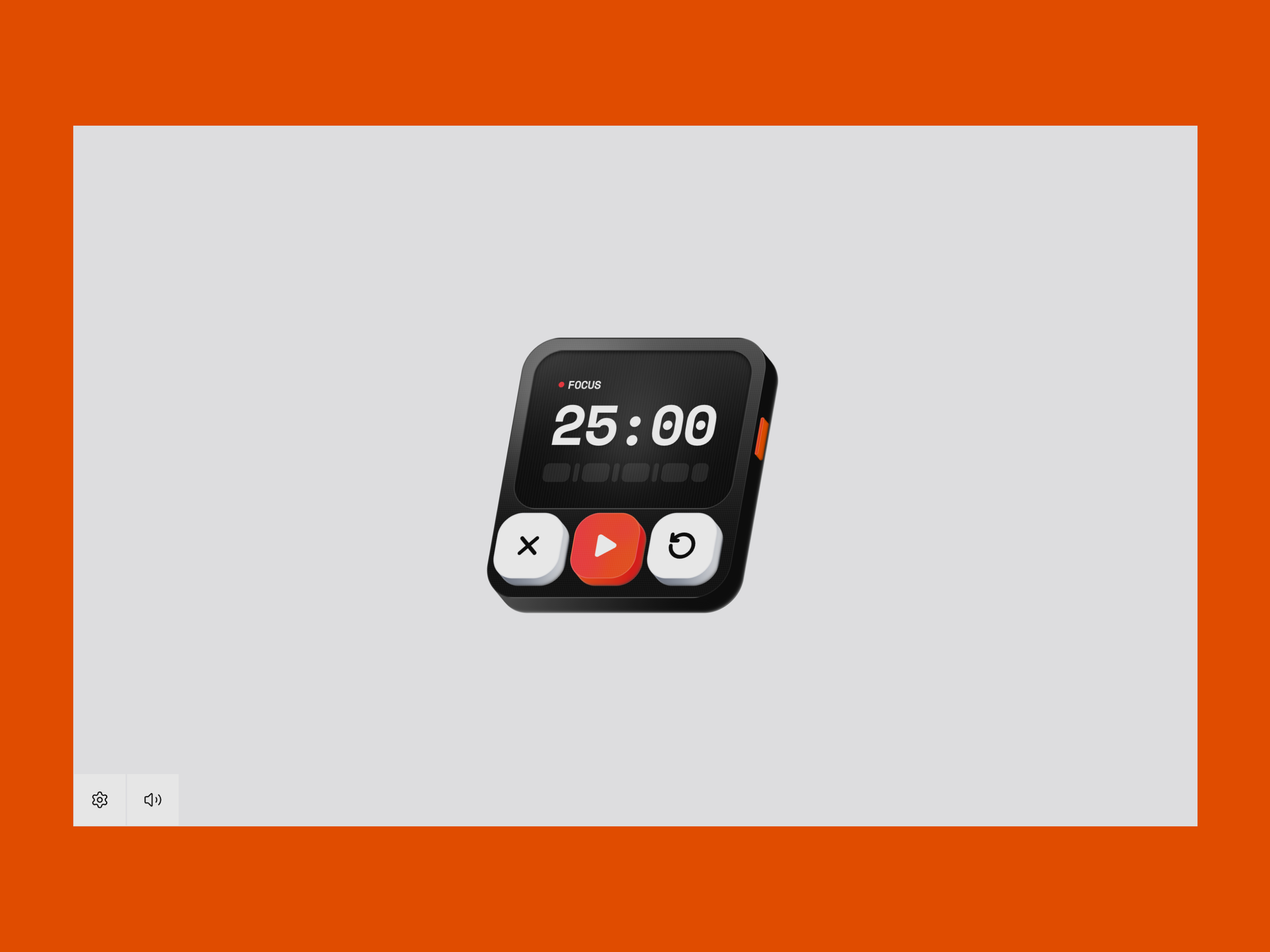
This was a UI exercise: build a Pomodoro timer that feels physical and three-dimensional, without pulling in Three.js, react-parallax-tilt, or any other 3D library. I started in Figma with the Fast Isometric plugin to lock in the angle and proportions, then rebuilt the device in React with Tailwind CSS, plain JavaScript, and Framer Motion. Check out the results at here.
Fake 3D without a library
The depth is an illusion. Instead of a mesh or canvas, I stack identical rounded rectangles and offset each one by 1px down and to the right. Sixteen layers on the main card, eight on each button, six on the side knob. At 60% opacity they read as a solid extrusion.
{Array.from({ length: 16 }, (_, i) => i + 1).map((d) => (
  <div
    key={d}
    className="absolute inset-0 rounded-xl bg-linear-to-r opacity-60 from-[#4C4C4C] to-black z-0"
    style={{ transform: `translate(${d}px, ${d}px)` }}
  />
))}Gradients sell the lighting. The card body uses a vertical gray-to-black gradient; buttons alternate orange-red or gray-white depending on variant. Semi-transparent white borders (`border-white/10`, `border-white/20`) catch light on the edges.
For texture, a 2×2px CSS grid overlay sits on the display and buttons — two perpendicular linear gradients at low opacity. The screen also gets `shadow-inner` for a recessed look, blur orbs for specular highlights, and eighty 1px vertical lines mapped across the display to mimic scanlines.
className="bg-[linear-gradient(rgba(255,255,255,0.2)_1px,transparent_1px),linear-gradient(90deg,rgba(255,255,255,0.2)_1px,transparent_1px)] opacity-20 absolute inset-0 [background-size:2px_2px]"Motion and interaction
Framer Motion handles the ambient sway and the card's isometric skew. An outer wrapper bobs on an infinite `y: [0, -10, 0]` loop over 1.8 seconds. The inner card rests at `skewX: -10` with `perspective: 1000px` so the tilt reads as three-dimensional.
<motion.div
  animate={{ y: [0, -10, 0] }}
  transition={{ duration: 1.8, ease: "easeInOut", repeat: Infinity }}
  style={{ perspective: "1000px", transformStyle: "preserve-3d" }}
>On every control click, `pulseCardSkew` fires: a fast snap to `skewX: -8`, then a spring back to `-10`. It gives the whole device a tactile wobble without being distracting.
await cardSkewControls.start({
  skewX: -8,
  transition: { duration: 0.045, ease: [0.25, 0.8, 0.25, 1] },
});
await cardSkewControls.start({
  skewX: -10,
  transition: { type: "spring", stiffness: 100, damping: 10, mass: 0.28 },
});Tailwind handles the button press-down separately. Each button sits offset with `translate-x-[-8px] translate-y-[-8px]` so it looks raised. On `:active`, `translate-x-0 translate-y-0` snaps it flush — like pushing a physical key into the chassis.
className="relative translate-x-[-8px] translate-y-[-8px] active:translate-x-0 active:translate-y-0"Sound feedback
Every button tap plays a short click through the HTML Audio API. A separate alarm sound fires when a stage completes. Both respect a mute toggle stored in settings.
const playClickSound = useCallback(() => {
  if (settings.muteAllAudio) return;
  const audio = clickAudioRef.current;
  if (!audio) return;
  audio.currentTime = 0;
  void audio.play().catch(() => {});
}, [settings.muteAllAudio]);The `Button` wrapper calls `playClickSound()` before `onClick`, so close, play/pause, reset, settings, apply, and mute all share the same feedback. Small detail, but it makes the interface feel like hardware.
Settings that reshape the UI
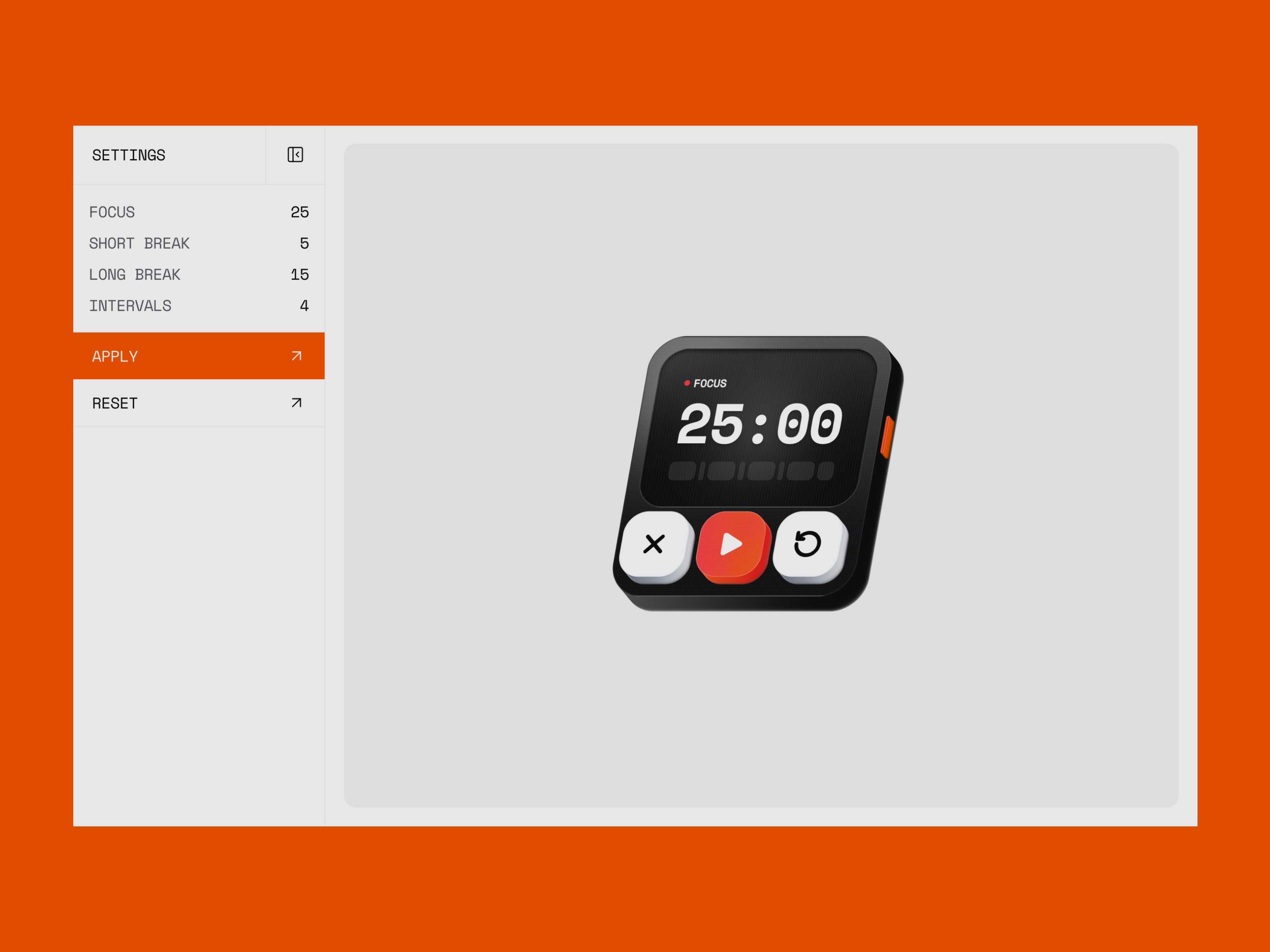
The settings drawer lets you change focus length, short break, long break, and how many intervals before a long break. Those values don't just update a number — they rebuild the entire stage list and progress bar layout.
const stages = useMemo(() => {
  const nextStages = [];
  for (let i = 1; i <= settings.longBreakInterval; i += 1) {
    nextStages.push({
      label: "Focus",
      seconds: settings.pomodoroMinutes * 60,
    });
    const isLast = i === settings.longBreakInterval;
    nextStages.push({
      label: isLast ? "Long break" : "Short break",
      seconds: (isLast ? settings.longBreakMinutes : settings.shortBreakMinutes) * 60,
    });
  }
  return nextStages;
}, [settings]);The progress bar maps one segment per stage. Each segment's flex weight is proportional to its duration (`flex: ${seconds} 1 0%`), so a 25-minute focus block is visually wider than a 5-minute break. The active segment fills with a linear 1-second width transition while the timer runs.
- 1] Focus: Work interval in minutes; drives the main countdown and the largest progress segment.
- 2] Intervals: How many focus sessions before a long break; controls how many segments appear in the bar.
- 3] Apply: Normalizes input, saves to localStorage, resets to stage 0, and rebuilds the visible timer.
Deployment
Deployed with Vercel. Try it for yourself at here.