BALANCE
Mood Tracking and Journaling App.
ROLE | UI/UX Designer
TIMELINE | March 2025 – September 2025
TOOLS | Whiteboarding, Figma, XCode, Kotlin
COLLABORATORS | Solo Project
ABOUT
Overview
Balance is a mood tracking and journaling app designed to help users track their mood and emotions over time. The app has two functions. Firstly, it allows users to select how they feel from a list of six emotions. Secondly, it allows users to write a journal entry to reflect on their emotions. Designed with the intent of creating an intimate and slow space for users to truly reflect.
Context
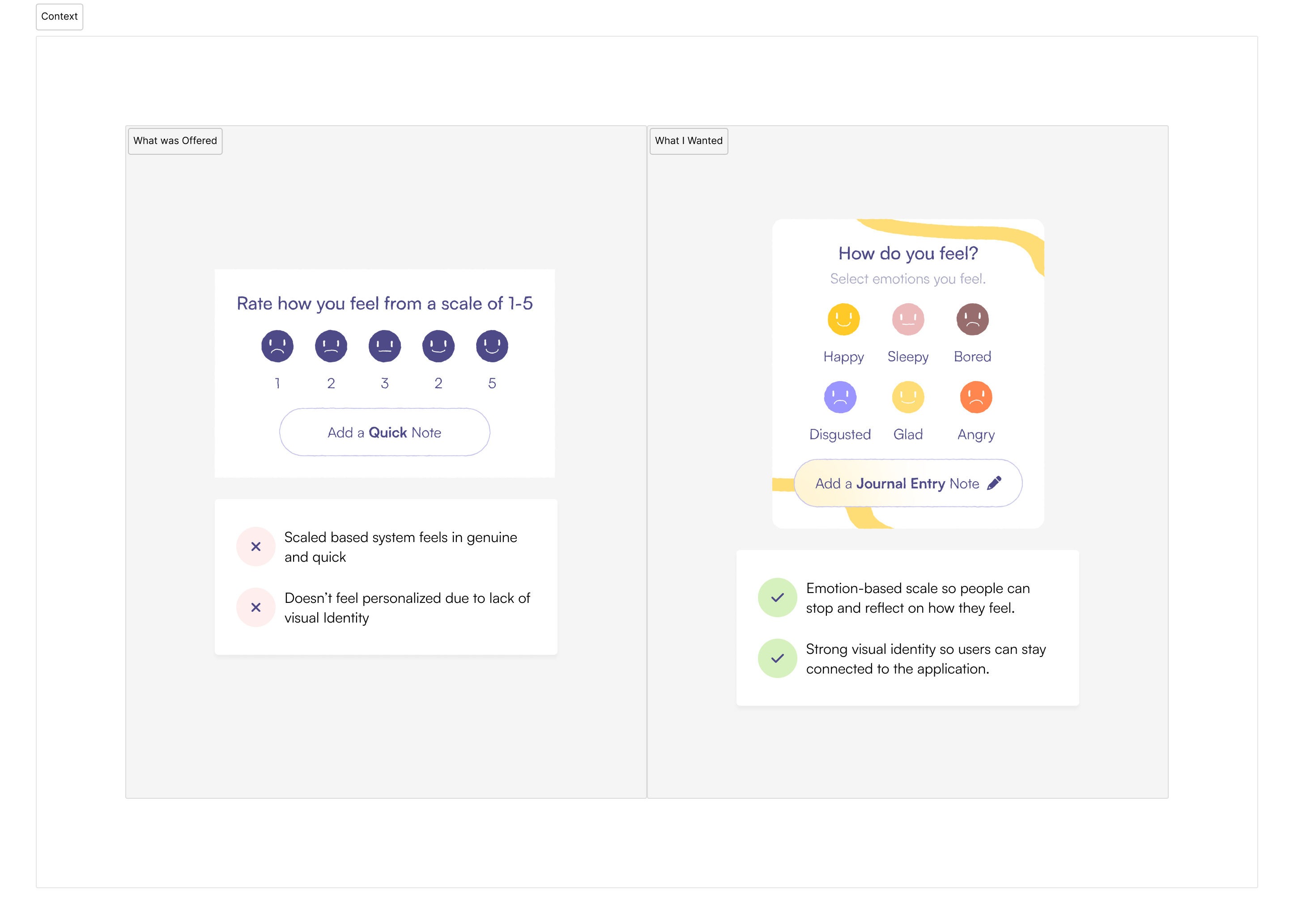
I like to find design inspiration from everyday life. A while back, I tried to find a mood tracking and journaling app that I liked. Firstly, most apps were designed to be "quick and easy", asking users how they feel with a scale-based system rather than an emotion-based system. Secondly, I found that most apps were cluttered and didn't have strong visual identity or personality. These problems inspired me to create a mood tracking and journaling app that was designed to be slow, intimate, and personal. I realized that I wanted an app that was more personalize, intimate, and reflective.
DISCOVER
Initial Brainstorming
Before conducting competitive analysis, I went through and thought about my own journaling process. What features would I as a user want to see in a mood tracking and journaling app? When would I use it? How would I want to use it? Where would I want to use it? Who would I want using it? Based on these questions, I jotted down on a whiteboard a quick list of the features I wanted to see in a mood tracking application. I utilized the 5 W's and H to help me brainstorm and come up with the features.
What features would a user want in an app like this?
Users would want the app to be minimal yet friendly and approachable. Users would want an app that follows an emotion based system rather than a number based system.
Who would be using an app like this? Who would be the target audience?
The target audience would be teens and young adults who want to be deeply connected to their emotions.
When would a user use it?
A user would use it at night when they have 5-20 minutes to just reflect on their day and emotions.
Where would a user use it?
A user would use it on their phone in a quiet and private space.
Why would a user use it?
A user would want to use it to improve their well-being through means of self-reflection and journaling.
How would a user use it? What would be the user flow?
A user should be able to quickly select how they feel and write a journal entry in a few seconds.
Problem Statement
How can I design a mood-tracking and journaling experience that feels emotionally intimate, reflective, and genuinely human while remaining minimal, clean, and approachable? The app should be designed for teens and young adults seeking a simple, emotion-based way to reflect on their day, connect with their feelings, and improve their well-being through moments of calm self-reflection.
Market Research
To better understand the mood tracking and journaling market, I analyzed three popular apps available on both the App Store and Google Play Store. I analyzed the apps for their UI, overall user experience, and how they make the user feel.

Moodfit | 4.1/5 Rating
Pros
The Journaling aspect - Users love the journaling aspect of the app, and how it allows them to engage and interact with their emotions.
A ton of features - The app offers everything from mood tracking to sleep, nutrition, and activity tracking.
Cons
Lack of emotion based system - The app uses a number based system rather than an emotion based system, making it difficult to reflect on their emotions.
Confusing UI - Users report the UI is really hard to navigate due to how many features there were - the app didn't have one clear primary feature.
Pay to Use - Many users state that most features are hidden behind a paywall, making it frustrating to use. Some even reported the app purposefully deleting their journal entries if they do not pay.
Daylio | 4.5/5 Rating
Pros
Cute UI – Users love the soft, colorful, and minimal aesthetic of the app, making it feel friendly and approachable.
Simple and Quick – Users appreciate how easy it is to log moods and activities without needing to type or overthink.
Cons
Limited Emotional Depth – Users mention that while it’s simple, the app lacks space for reflection or journaling; only space for a quick note section.
Repetitive Experience – Logging moods can start to feel routine and surface-level over time, without deeper insights or emotional connection.
Subscription Model – Some users feel that many customization options and advanced analytics are locked behind a paywall.
Insights from Psychology
I also reviewed psychological and UX research to ground my design decisions in evidence-based principles. These studies provided context on two key areas: first, how to design an emotion-based ranking system that reflects real human emotional patterns, and second, how to create an experience that feels more human-centered, reflective, and emotionally intuitive.
Six Primary Emotions Across Cultures
Building on Ekman’s six basic emotions—happiness, sadness, fear, disgust, anger, and surprise (Cherry, 2025)—this framework informed the app’s emotion-based system. The selected moods reflect a balance of high and low arousal states, simplifying choices and promoting genuine reflection.
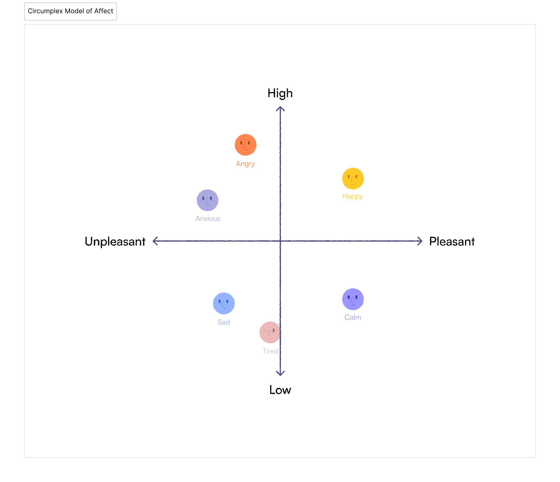
Two-Dimensional Model of Emotion — Valence and Arousal
Posner, Russell, and Peterson’s Circumplex Model of Affect (2005) shows that emotions can be understood using two key dimensions: valence (pleasant to unpleasant) and arousal (high to low energy). This model helps explain that emotions exist on a spectrum rather than as separate categories. (Posner, Russell, & Peterson, 2005)
Mixed Emotions Are Common in Daily Life
Smillie (2020) found that mixed emotions are far more common than purely negative ones, occurring up to 36% of the time in daily life—even during the COVID-19 pandemic. This highlights the importance of designing an emotion-based ranking system that reflects the natural complexity of human feelings. (Source: Smillie, 2020, Psychology Today)
Simplify Decision-Making with Hick’s and Miller’s Law
According to Yablonski’s *Laws of UX* (2025), Hick’s Law explains that decision time increases with the number and complexity of choices, while Miller’s Law shows that people can only retain about 7 ± 2 items in working memory. Limiting the app to six emotions aligns with these principles—reducing cognitive load and enabling smoother, more mindful interactions. (Source: Yablonski, 2025, Laws of UX)
DEFINE
Market Analysis
After discovering and conducting market research, and getting quantative data, I summarized my data into relevant market analysis.
Use Six Core Emotions to Balance Simplicity and Depth
By combining Ekman’s six basic emotions: happiness, sadness, fear, disgust, anger, and surprise (Cherry, 2025) with insights from the Circumplex Model of Affect (Posner, Russell, & Peterson, 2005), I selected six final emotions for the app: joy, sadness, anger, calm, tired, and anxious. This combination captures both high and low arousal states while maintaining intuitive simplicity. Limiting the selection to six aligns with Hick’s and Miller’s laws (Yablonski, 2025), reducing decision fatigue and encouraging users to slow down and genuinely reflect on their mood.
Prioritize Depth Over Breadth in Feature Design
From competitive analysis, users preferred apps with one strong, cohesive feature over those overloaded with tools. Daylio’s success comes from its simplicity and clear focus, while Moodfit’s complexity overwhelms users. We will adopt this insight by focusing deeply on one core concept - emotion-based journaling. Users can set reminders, view journal history, but all featuers would point back to the core concept of emotion-based journaling.
Establish a Soft, Approachable Visual Identity
Users respond positively to soft, pastel color palettes and rounded UI elements, as seen in Daylio and Headspace. These visual cues create a sense of calm and trust, essential for a reflective and emotionally safe space. Balance uses pastel blues, soft shadows, and hand-drawn accents to feel gentle, personal, and human-centered.
Answer Statement
To create a mood-tracking and journaling app that feels personal and reflective, the design focuses on simplicity and emotional connection. Rather than a simple 1-10 scale of how a user feels, the app uses six core emotions: joy, sadness, anger, calm, tired, and anxious. Users can select one or more based on how they feel. By keeping choices limited and the interface soft and minimal, users can slow down, reflect, and connect with their emotions in a calm, focused space.
DESIGN
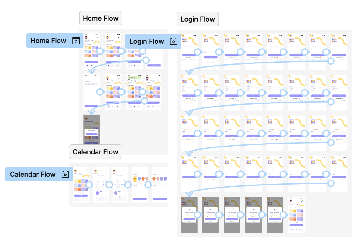
User Flows
Before design, we created user flows to understand the user's journey through the app. This included flows for login, tutorial, gameplay, app navigation, shop, and settings.
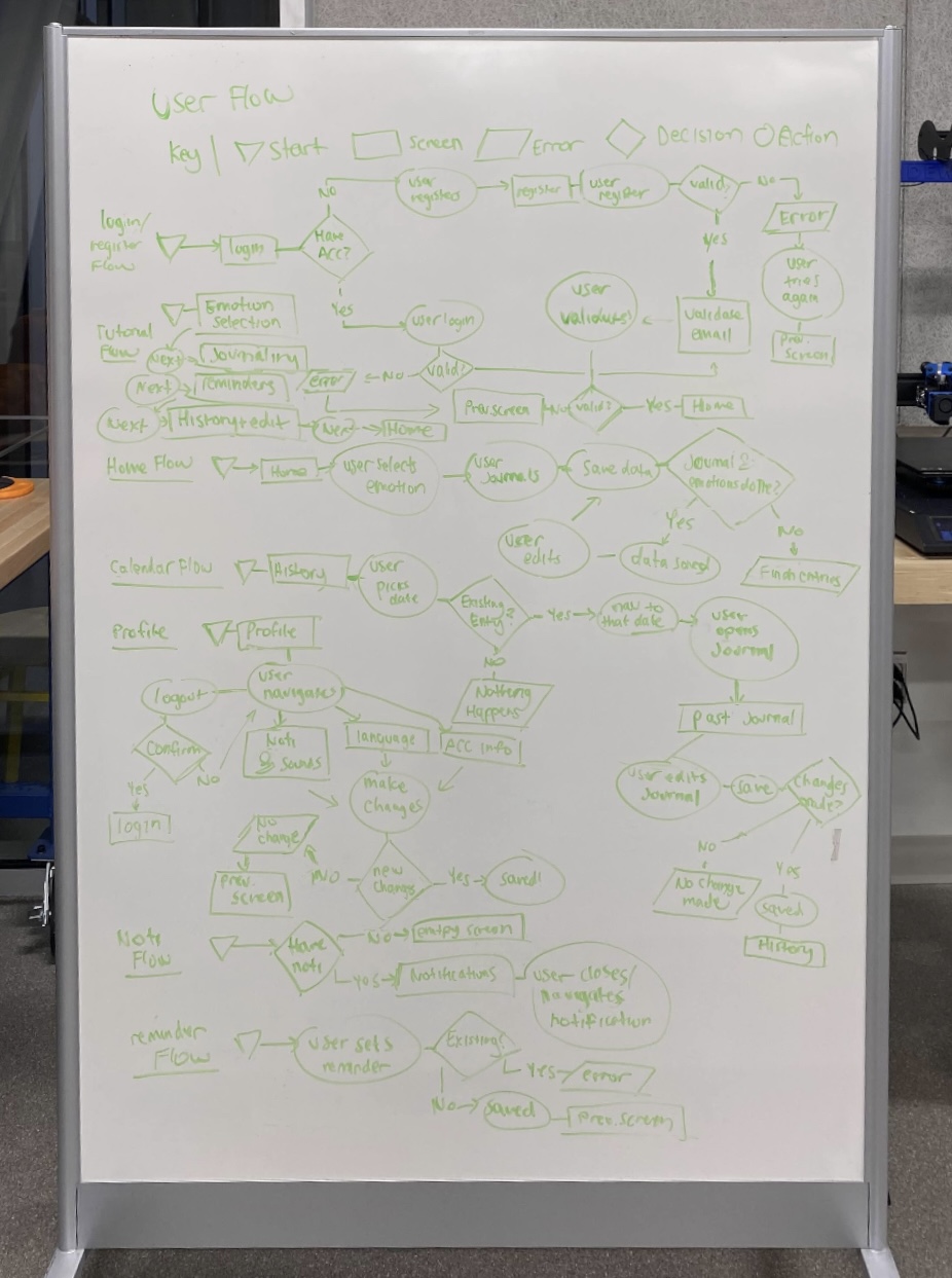 User flows for the app done through traditional whiteboarding.
Low Fidelity Wireframes
Once we had a clear understanding of the user flows, we created low fidelity wireframes to test it's validity. Throughout the process, we created different iterations for different screens. Our main goal was just to get a feel for the app and and validate the user flows.
 Low fidelity wireframes for the app also done through traditional whiteboarding.
Design Tokens
Once user flows and low fidelity wireframes were created, we moved onto Figma. First, we went with a pastel and soft color palette. As said in market analysis, we are going to go with a pastel blue as a primary color. For typography, we went with Satoshi Variable, a clean and minimal font that is easy to read and understand. To keep things structured, we followed the 4 point grid system for font sizes, spacing, and radius.
 Design Tokens will later be used to create the design system.
Design System
Once design tokens were created, I followed atomic design principles to create a design system. This includes atoms, molecules, organisms, templates, and pages.
 Atoms
Atoms Molecules
 Organisms
 Templates
 Pages
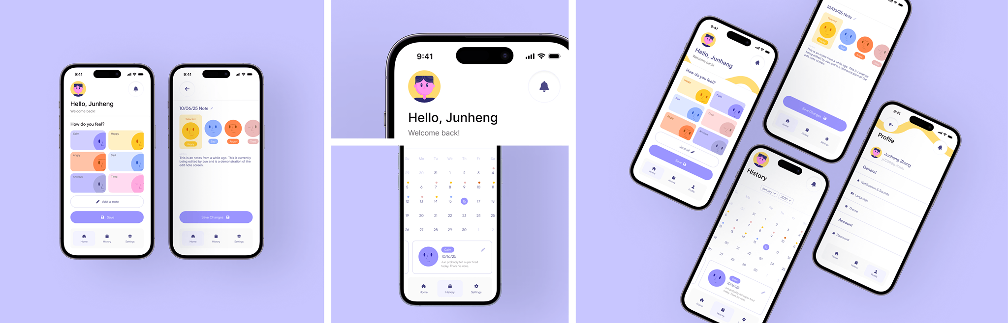
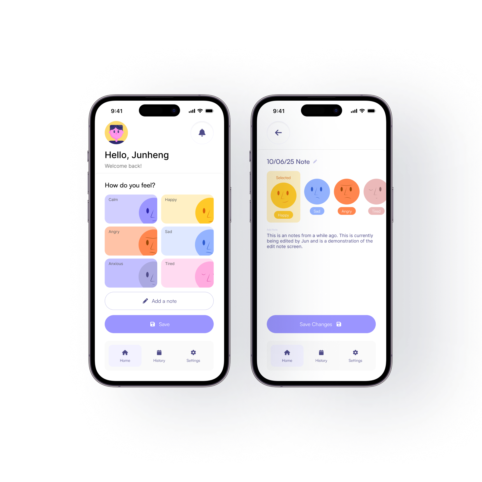
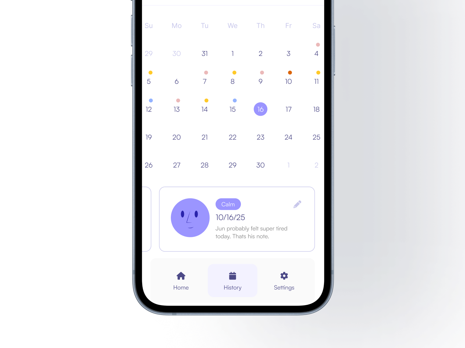
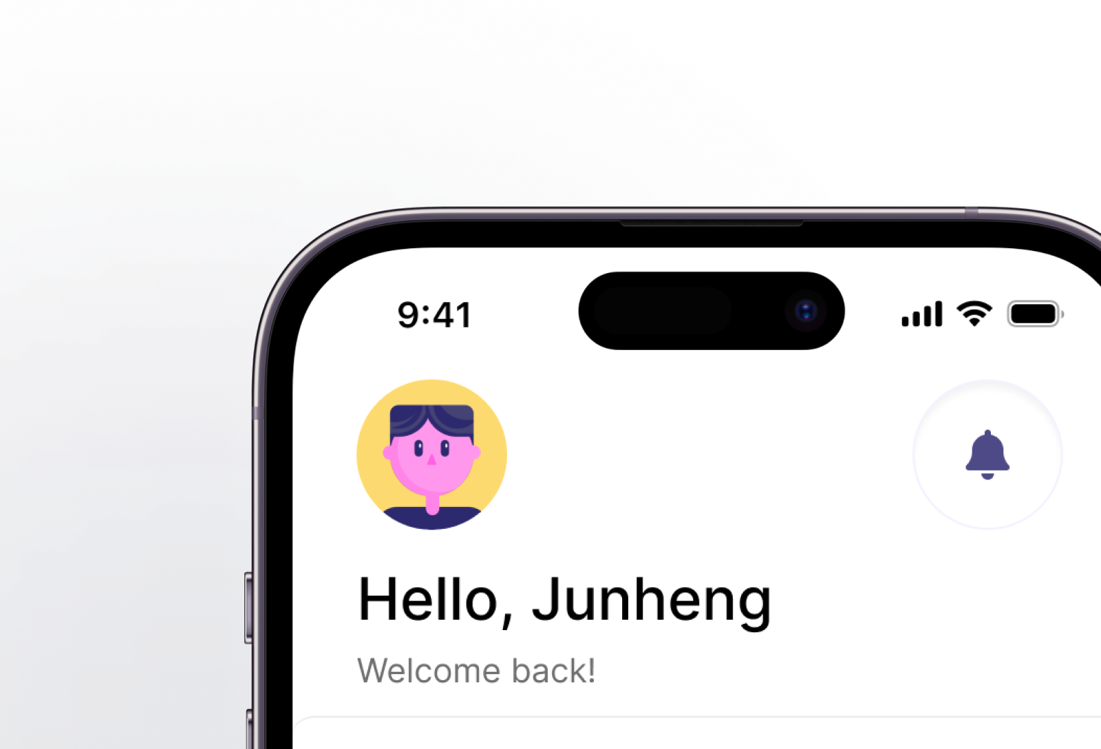
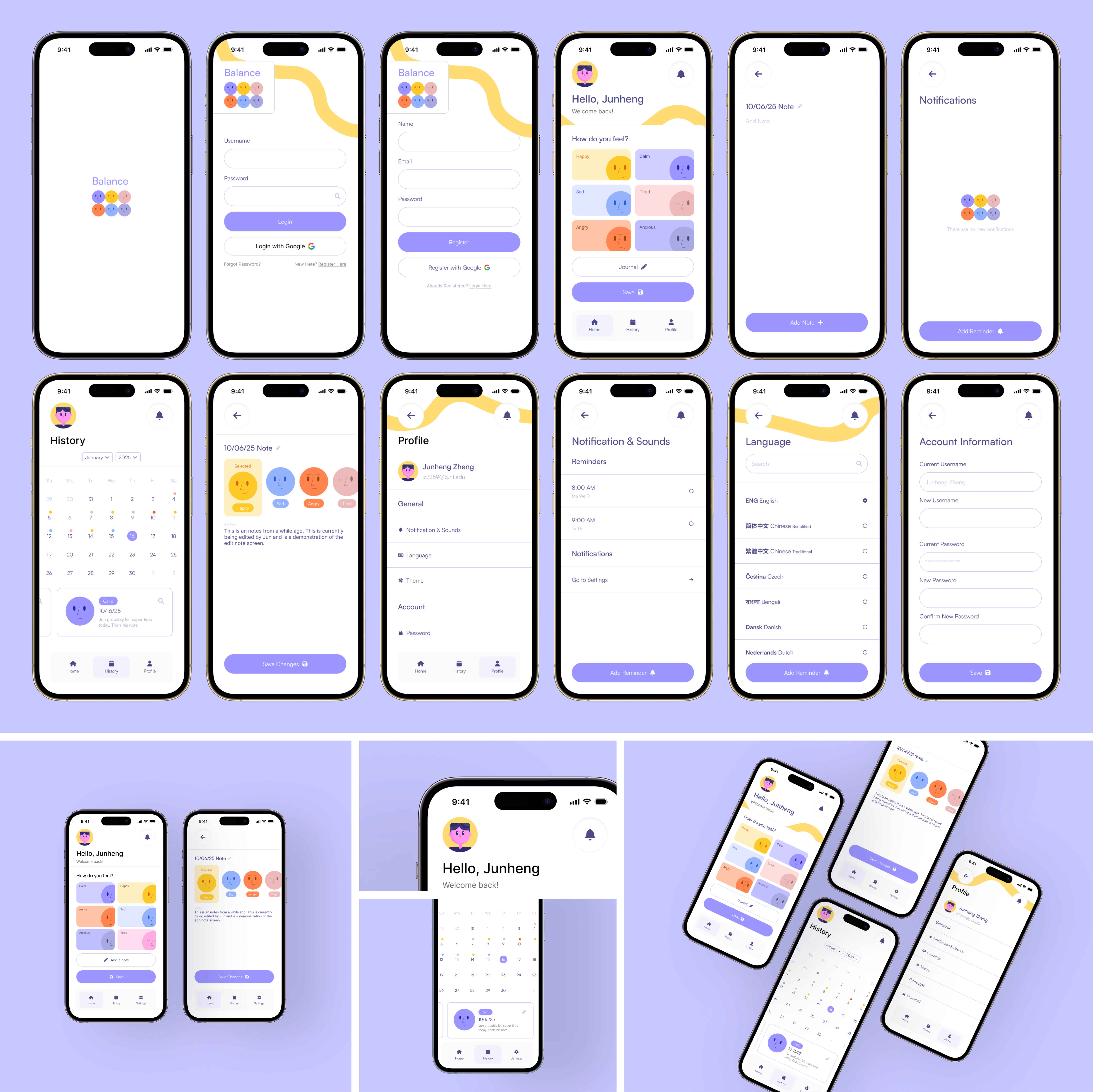
PagesHigh Fidelity Wireframes and Edge Cases
By utilizing the design system, we created high fidelity wireframes for each page, with edge cases for each screen.
 High fidelity wireframes
Prototypes
With the high fidelity wireframes finished, we took a look back at the user flows we created, and created prototypes for each flow. Usually, I would create prototypes for each flow, but in this case, I only created flows for what I had trouble visualizing. This is because I would be developing the app myself later on in the development process.
 User flows
DELIVER
Final Preview
With the research and design phase done, I started the coding process. Currently, I am taking these designs and creating the app in both Xcode and Kotlin.
REFERENCES
Cherry, K. (2025). The 6 types of basic emotions and their effect on human behavior.Verywell Mind. https://www.verywellmind.com/an-overview-of-the-types-of-emotions-4163976
Posner, J., Russell, J. A., & Peterson, B. S. (2005). The circumplex model of affect: An integrative approach to affective neuroscience, cognitive development, and psychopathology. Development and Psychopathology, 17(3), 715–734. https://pmc.ncbi.nlm.nih.gov/articles/PMC2367156/
Smillie, L. D. (2020, May 13).Mixed emotions are much more common than negative ones.Psychology Today. https://www.psychologytoday.com/us/blog/the-patterns-of-persons/202005/mixed-emotions-are-much-more-common-than-negative-ones
Yablonski, J. (2025).Hick’s Law. Laws of UX. https://lawsofux.com/hicks-law/
Yablonski, J. (2025).Miller’s Law. Laws of UX. https://lawsofux.com/millers-law/